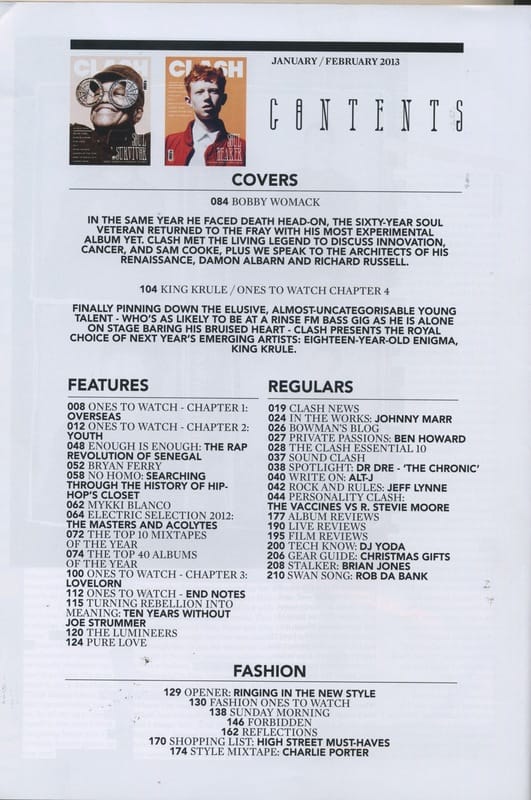
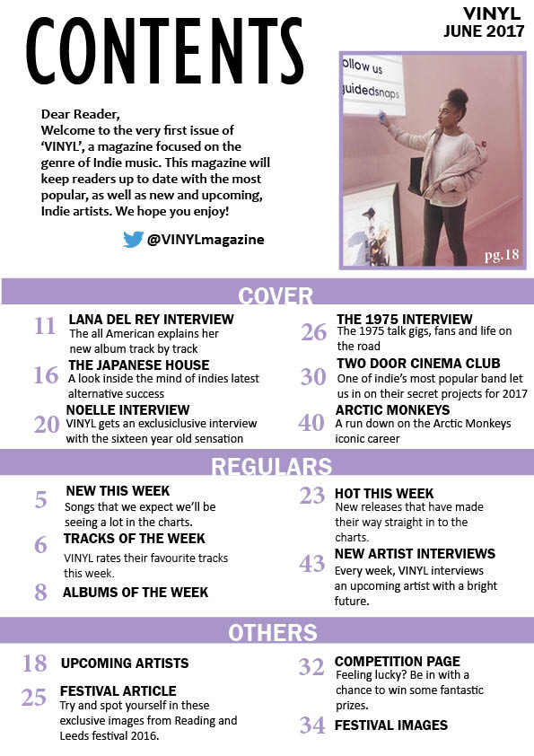
Final Contents Page
Creation
|
Initially, I had an entirely different vision of how my contents page was going to appear. I had initially used another image with a light blue background. However, I decided to change this due to the fact that this model had been used in all aspects of my magazine, and using a different model shows diversity and reaches a broader audience.
I also changed the image as it did not conform with my vision to have one colour staying consistent throughout the magazine so it is all tied together and appears to be from the same magazine. The light blue background clashed with the lilac colour I had chosen for my front cover, so therefore I could not keep with the consistency. The layout of the text on the page was also not typical and did not look like a contents page. This was changed to avoid the reader being confused. The use of multiple other pictures was also abandoned due to the business on the contents taking away from the main image in the top left. |

|