Masthead Draft
|
Masthead One
For the first masthead, I experimented with a large, bold font. This is so that the masthead has a lot of attention drawn to it as it is a vital aspect to the front cover of my music magazine. The colour of the masthead is not definite as I do not want it to clash with the background colour that I decide to lose. It is likely that the real colour of the masthead will be black or white, like a stereotypical, traditional music magazine. |
Masthead Two
For the second masthead, I experimented with a thinner, serif font. This gave the magazine a more sophisticated feel, however I believed this clashed with the target audience for my magazine, which is teenagers and young adults. I believe this feature wouldn't attract them. Once again, the colour of the masthead was not definite as it will likely end up being a black or a white to follow the conventions of a typical music magazine. |
The name of my magazine is going to be 'Vinyl'. This is due to the fact that Vinyls are a way of listening to music, they are not targeted specifically to one genre, much like my magazine, yet are mostly popular nowadays for Indie music. Indie is the genre of music that I am mostly targeting my magazine towards.
Layout Draft
|
Layout One
For the first layout draft, I kept it minimalistic and neat. This is due to the fact that the participants in my survey preferred this style compared to overcrowded, busy front covers. There is a main cover line, much like CLASH and NME magazine (which I took inspiration from) and a bold, clear masthead. |
Layout Two
For my second layout draft, I used a light pastel colour for the background. This incorporates the colour scheme I was going to use as it is a soft, light colour, as this is what my target audience prefers on a music magazine front cover. A strap line may also be included above the masthead, this is to give a brief overview of what this magazine focuses on to any audiences who might not be familiar with it. |
Mode Of Address Draft


|
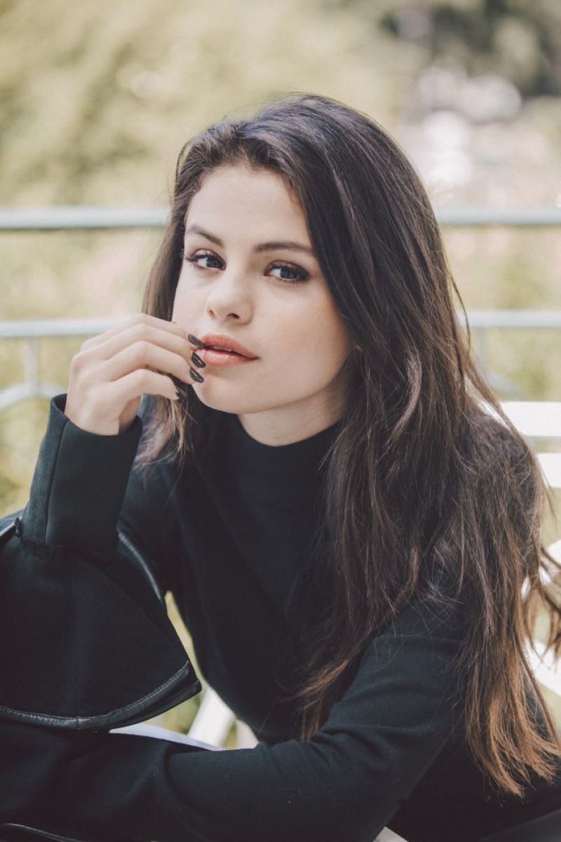
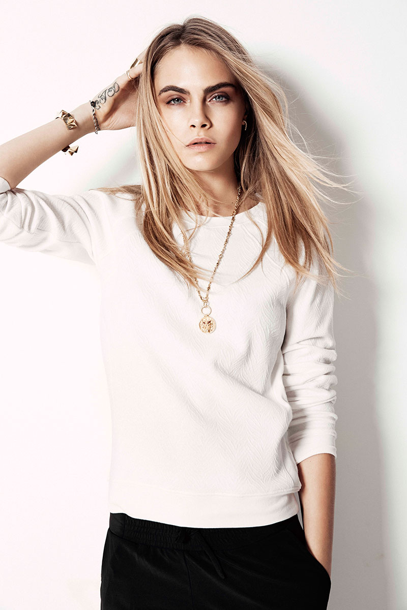
Direct Mode Of Address The mode of address in the first image is that the model is looking directly in to the lens of the camera. This creates a more emotional attachment towards the reader of the magazine towards the magazine as they feel as though they are being singled out and as if the model is looking directly at them. This attachment will make the audience more likely to end up purchasing the magazine. Because of this, I will likely chose a shot for my front cover where the model is displaying direct mode of address. Indirect Mode Of Address The second image clearly shows indirect mode of address as the model is looking away from the camera. This causes the reader to question what exactly the model is looking at as it is not shown within the image. This effect is not as commonly shown on covers of magazine as it does not create a personal attachment between the reader and the magazine, instead, it intrigues the reader as opposed to enticing them. Therefore, I am more likely to recreate a shot where the model is clearly displaying direct mode of address. |
Colour Scheme Draft

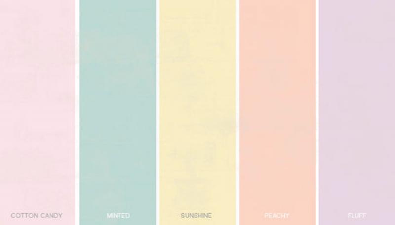
The colour scheme for my magazine is going to be pastel, this is due to the fact that my audience survey feedback informed me that this is the most requested colour scheme. My music is also based on the genre of Indie music, this music is known for being light and happy, therefore these colours reinforce this feel as they are bright and connotative of happiness. Because of the colourful background, the masthead and cover lines are likely to be a black or white.
Contents Draft
|
Contents Draft One
The first contents page includes an image in the top left hand corner and a bold title of 'contents' next to it on the top third of the page. There are images on the right hand side that correlate to the articles within the magazine. This plan also contains a message from the editor to the reader. This feature makes the magazine more personal as the reader feels the editor is speaking directly to them. I decided not to follow this plan, however I did decide to take aspects from it and use them on the other plan, for example adding the editors message and having the image at the top of the page as opposed to squashed down at the bottom of the page.
|
Contents Draft Two
In this magazine contents plan, the articles are down the centre of the magazine as opposed to down the left hand side. This means more attention is focused on the articles which is the main focus. Another change is that the image is in the bottom left hand corner as opposed to the top. This is the basic contents plan I followed, except after trying the image in the top right hand corner with this plan, it looked better as opposed to at the bottom. I also included the message from the editor to the reader underneath the contents.
|
Centre Spread Draft
|
Centre Spread One
The first centre spread draft includes a full page image on the left hand side and the article on the left. The title of the double spread has a small image of the artist placed next to it on the right hand side. This image will be taken using a different camera angle and shot than the large image on the left to show diversity. There will also be one large long shot of the artist at the bottom of the page underneath the article. This centre spread conforms with the minimalistic and neat idea that is also displayed on the cover of the magazine. However, I will not be adding the image next to the title, instead I will be doing an introduction to the artist as well as putting the artists name and a caption on the image. |
Centre Spread Two
The second centre spread includes the full page image on the right hand side, this is due to the fact that the first thing the audience will see and read is the article, and will then have time to look at the large image of the artist, which is preferably a close up shot. This draft includes a small introduction to the article and artist which I think is important as it may help readers who are not familiar with the artist, understand and comprehend their genre and vibe. The text on the draft is more spaced out and there is also more images. I prefer this draft as it is more enticing to my target audience of teenagers and young adults as it is not too bombarded with text and is simple. |
Flat Plan
Mock Poses

|

|
Front cover
The main image that I will use for the front cover of my magazine will be a medium or medium long shot. This is due to the fact that it allows the models stance and outfit to be viewed, which can reveal a lot about their style, personality and potentially genre as a musician. This magazine is also inspired by the CLASH magazine, which is a music and fashion magazine. This means that my audience will be interested in the music and the fashion of the artist, their clothing is most easily revealed by a medium or medium long shot. |

|
|
Double Spread The main image used on the double spread is likely going to be a close up shot of my model. This is due to the fact that this section of the magazine is purely about them, and the vibe of this area of the magazine is intimate and personal, therefore having a close up shot of the models face reflects and follows this convention. |

|

|
Contents The image used for the contents page is going to be similar to one of the two images displayed on the left. Both of these images include the model sitting on a chair. I believe this shot would be effective as it is a laid back type of shot, which will contrast to the front cover where the model is likely to be stood posing. It targets my audience of teenagers to young adults as it does not appear too formal or sophisticated. |
Mock Shot Types
|

|
These two images show one of the shot types I would like to experiment replicating on the front cover of my magazine, a medium/ medium long shot. The shot type allows space around the model for cover lines and a space above for the masthead. However, the shot type also allows the audience to view what the model is wearing, this is important as the main magazine I am getting inspiration from (CLASH magazine) is also a fashion magazine as well as music. This means that it is likely my audience will be interested in the outfit of the artist, as well as their music. |

|

|
The second shot I would like to experiment with is a close up shot. This shot is cut off around the chest area and allows the main focus to go towards the models face. This shot will be useful on the front cover of my magazine as it will be clear who exactly is on the front cover, even when the magazine is far away. However, I believe this type of shot may be more useful on the contents or as one of the images included on the double page spread. This is due to the fact that a wide range of shots should be included on the double spread, and a close up would be particularly useful as the makeup and hair of an artist can say a lot about their personality and genre.
|
