Shoot One


|


|


|
For the first shoot, I got my model to stand in front of a light blue background as I was originally going to use this as my cover image. All of the angles for the shot were mid shots which revealed some of the models outfit as well as her facial features. I also experimented with direct and indirect mode of address to see which one would intrigue the reader more. Another thing I experimented with was the poses of the model, I had her do some quirky poses where she is playing with her hair to give the magazine a more laid back and informal feel to make it relevant to my target audience of teenagers and young adults.
Shoot Two


|


|


|
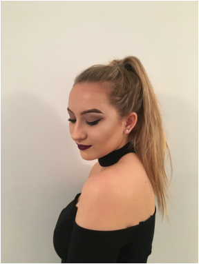
The second photo shoot was against a plain white wall. This was to conform with my theme of a simplistic and minimalistic magazine. Due to their being no background, there will be no distraction from the model in the image, masthead or any cover lines on the front cover. The shots range from medium long shots to medium shots. For my final magazine, I used one of these images for the main image on my front cover, and the second image is used for my double page spread. The shots of the artist on the chair give the reader an idea of the genre and style of indie that the artist creates, from her positioning on the chair, the reader can assume that the style is laid back, relaxed indie.
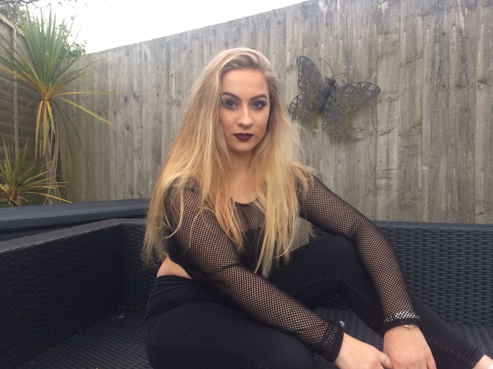
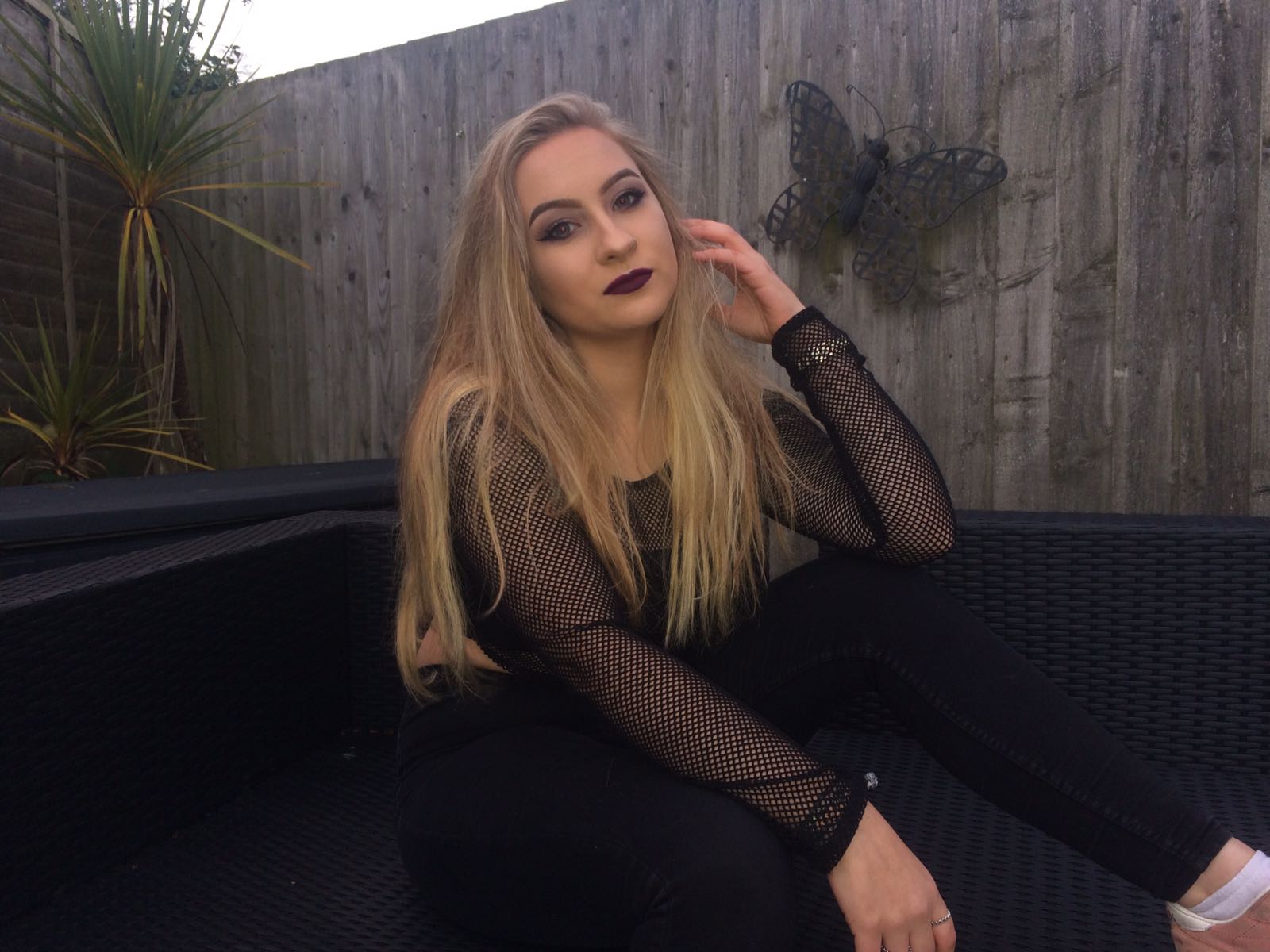
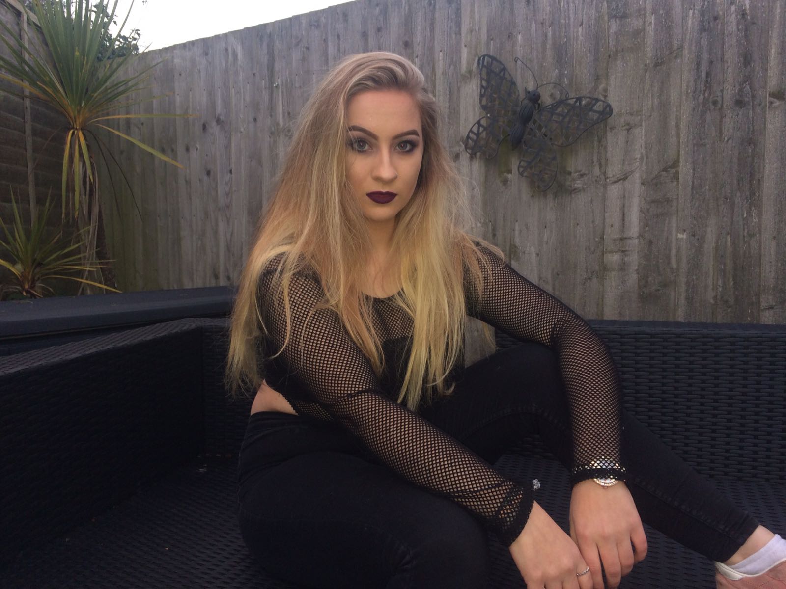
Shoot Three
|
|
|
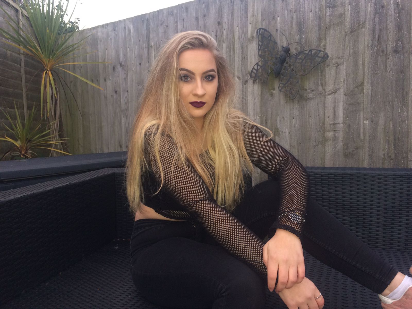
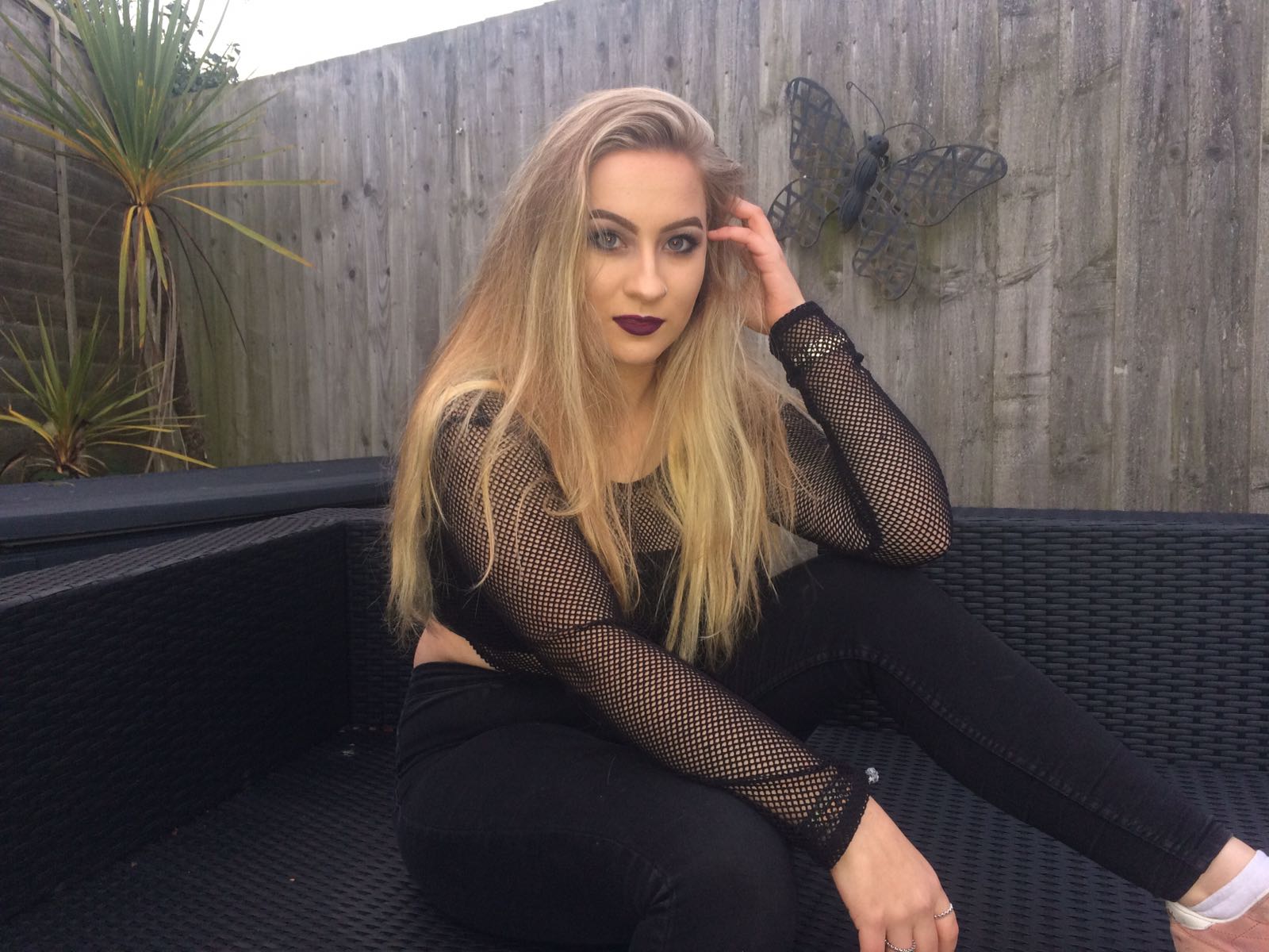
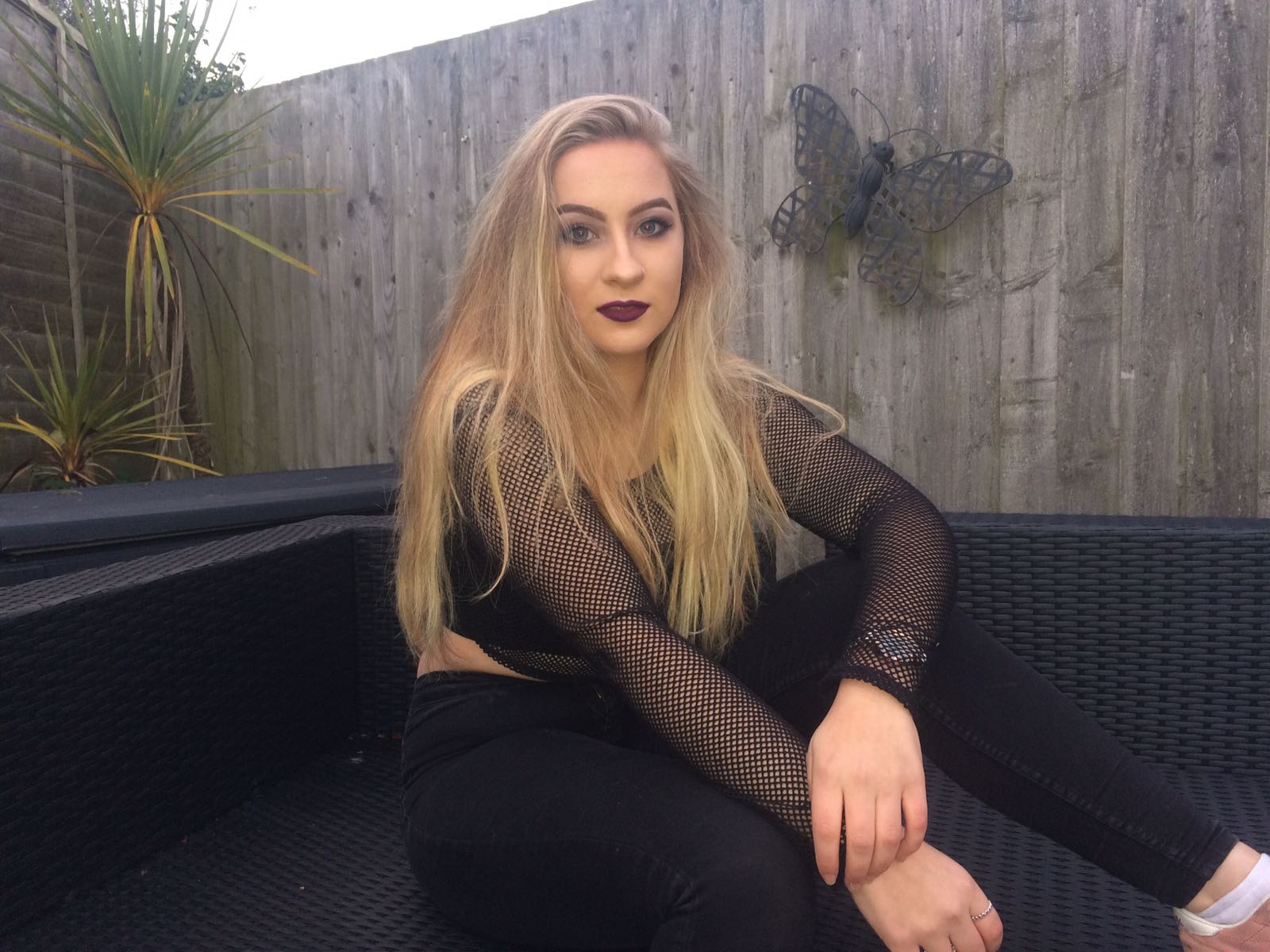
The third photo shoot is taken place in a different location outside, despite the fact that these images weren't included, they show diversity and variety amongst angles as all of these are long shots.
